I love to read through magazines, books and websites searching out new and interesting typefaces. I've blogged before about the importance of choosing the right typeface for a job - whether that be for a magazine spread or for wedding stationery - each font has a personality of its own and imparts a very particular style.
Earlier this week I was very excited to have a look through the new Lonny magazine. One of the cofounders is Michelle Adams, owner and designer of Rubie Green - they supply a fabulous range of geometric-patterned fabrics. What passion this woman must have - to run her hugely popular company AND start up a 150 page digital magazine! I am so impressed.

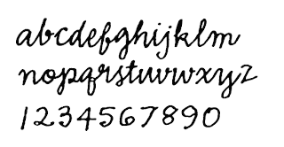
There was one typeface in Lonny magazine that really caught my eye - Emmascript.

It's fun and relaxed, mimicking a casual handwriting. I've used it a number of times in Wedding Style Guide - this was for our Garden Party story in Issue 6.

A handwriting-style typeface will put the reader at ease - it's inviting and unpretentious - like reading something from an old friend. Maybe a typeface like this is worth considering for your stationery.
Posted by Jane Cameron
Earlier this week I was very excited to have a look through the new Lonny magazine. One of the cofounders is Michelle Adams, owner and designer of Rubie Green - they supply a fabulous range of geometric-patterned fabrics. What passion this woman must have - to run her hugely popular company AND start up a 150 page digital magazine! I am so impressed.

There was one typeface in Lonny magazine that really caught my eye - Emmascript.

It's fun and relaxed, mimicking a casual handwriting. I've used it a number of times in Wedding Style Guide - this was for our Garden Party story in Issue 6.

A handwriting-style typeface will put the reader at ease - it's inviting and unpretentious - like reading something from an old friend. Maybe a typeface like this is worth considering for your stationery.
Posted by Jane Cameron


